
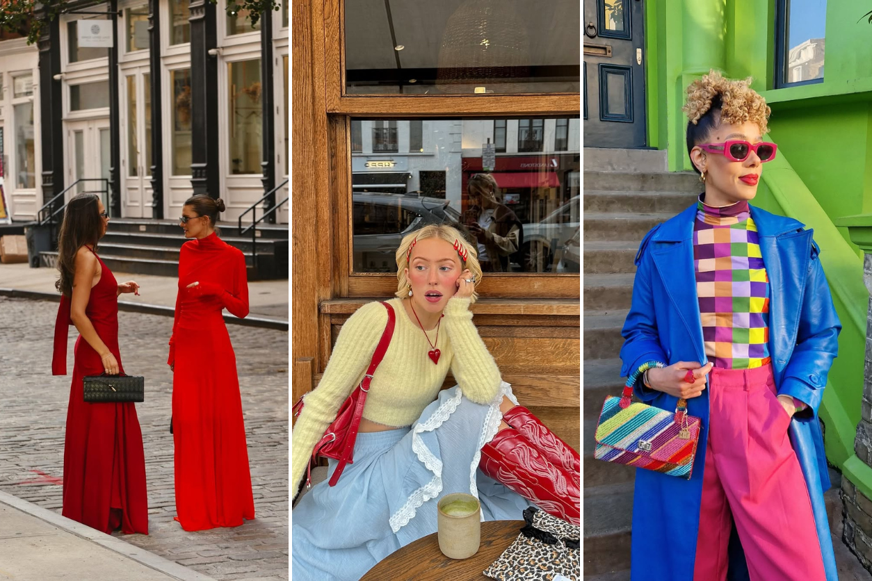
The 2025 fashion trends are all about contrast—not just between colors, but between moods.
Color trends in fashion tend to oscillate between two extremes: some seasons lean into bold, high-energy hues, while others embrace muted minimalism. Spring/Summer 2025 sits somewhere in between. The palette is vibrant but refined, playful but wearable. Instead of relying on a single color story, designers are mixing unexpected tones in a way that feels both fresh and intuitive.
Soft pastels are getting paired with rich, earthy tones. Primary colors are making a comeback but with a twist. Neutrals are still relevant, but they’re warmer, richer, and more dimensional. If the last few seasons were about safe, predictable color pairings, this year is shifting towards a more layered and dynamic approach.
Below, a look at the biggest color trends of Spring/Summer 2025 and how they’re being styled.
Powdery Pastels
Pastels always make an appearance for spring, but this time they’re less sugary, more sophisticated. Powder blue, dusty pink, and lavender are taking center stage, but they’re being paired in unexpected ways.
Instead of the usual pastels-with-white formula, designers are matching them with moody, deep hues. Powder blue is showing up next to burgundy and olive, giving it a richness that makes it feel less delicate. Lavender is getting a modern update with charcoal and deep brown, making it look more intentional and less like an Easter egg.
Even pink, which has been riding high post-Barbiecore, is evolving. Soft, muted pinks are being layered with terra cotta, mustard, and warm beige, making them feel grounded and grown-up. It’s less “romantic” and more “relaxed, effortless, and slightly nostalgic.”
Tangerine and Citrus Tones
Every few years, orange threatens to become the color of the season, and 2025 might finally be the year it happens. But not just any orange—tangerine is leading the charge.
Unlike the neon-adjacent shades of past seasons, this one is richer, deeper, and a little sun-faded. It’s bold but not aggressive, sitting somewhere between burnt orange and a golden apricot. Paired with mint or soft peach, it feels fresh and lively. Matched with deep burgundy or dark denim, it gets a sophisticated, almost retro edge.
This is a color that works best in flowy silhouettes—think linen dresses, oversized blazers, or slouchy bags. It’s statement-making without trying too hard, which is why it’s going to be everywhere.
Mocha Browns and Earthy Neutrals
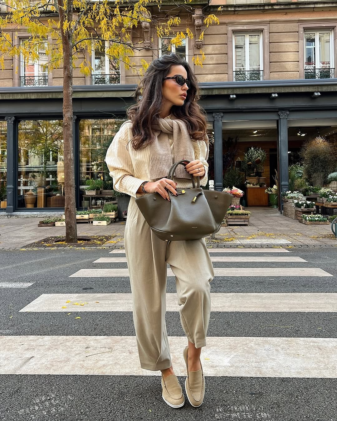
Minimalist dressing isn’t disappearing, but the stark, clinical neutrals of past seasons are softening. Beige and gray have been replaced with mocha, warm taupe, and soft camel. These tones feel earthy, rich, and almost sun-kissed, making them more inviting than the sharp, cool-toned neutrals that dominated recent years.
Designers are styling them in unexpected ways—mocha brown with sky blue, camel with butter yellow, and deep taupe with pale lavender. These combinations balance warmth and coolness, making them look less predictable and more modern.
Suede and textured fabrics make these shades feel even richer. A mocha-toned suede bag, for example, suddenly feels like a year-round staple rather than a strictly fall accessory. It’s a reminder that neutrals don’t have to be boring—they just need the right texture and depth.
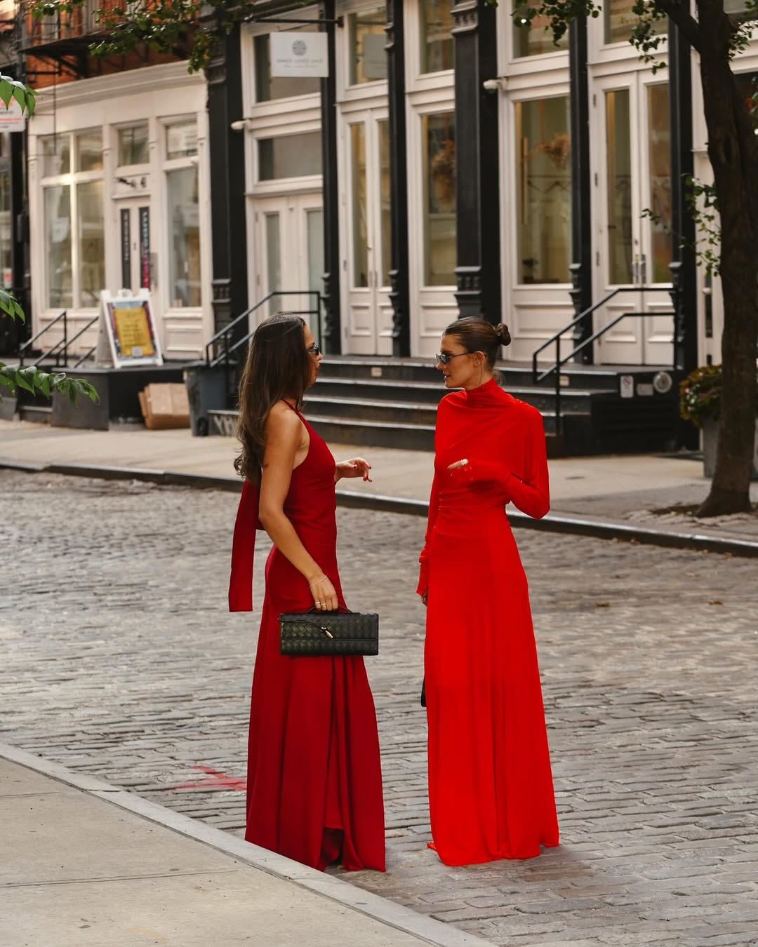
Red, But Make It Versatile
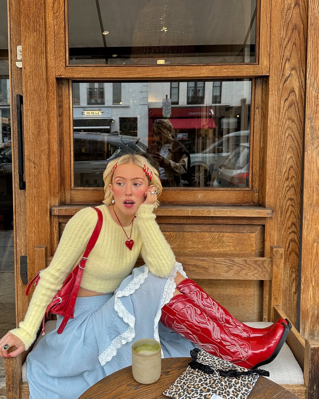
Red has been hovering on the edge of the trend cycle for a while, and 2025 is finally giving it a proper moment. But this isn’t just about wearing a head-to-toe red look—it’s about how red is being styled.
Instead of the usual red-and-black contrast, it’s being paired with powder pink, deep blue, and even mossy green. The result is a color that feels both strong and wearable. A red blazer over a muted pastel dress feels fresh rather than overpowering. A red leather bag with soft, neutral tailoring suddenly makes the entire outfit pop.
What’s interesting is how many different shades of red are trending at the same time. Bright true red is still dominant, but deeper hues—crimson, cherry, and merlot—are creeping into spring collections. This makes it easier to find a red that works for you, whether you prefer something bold or more understated.
Cobalt Blue
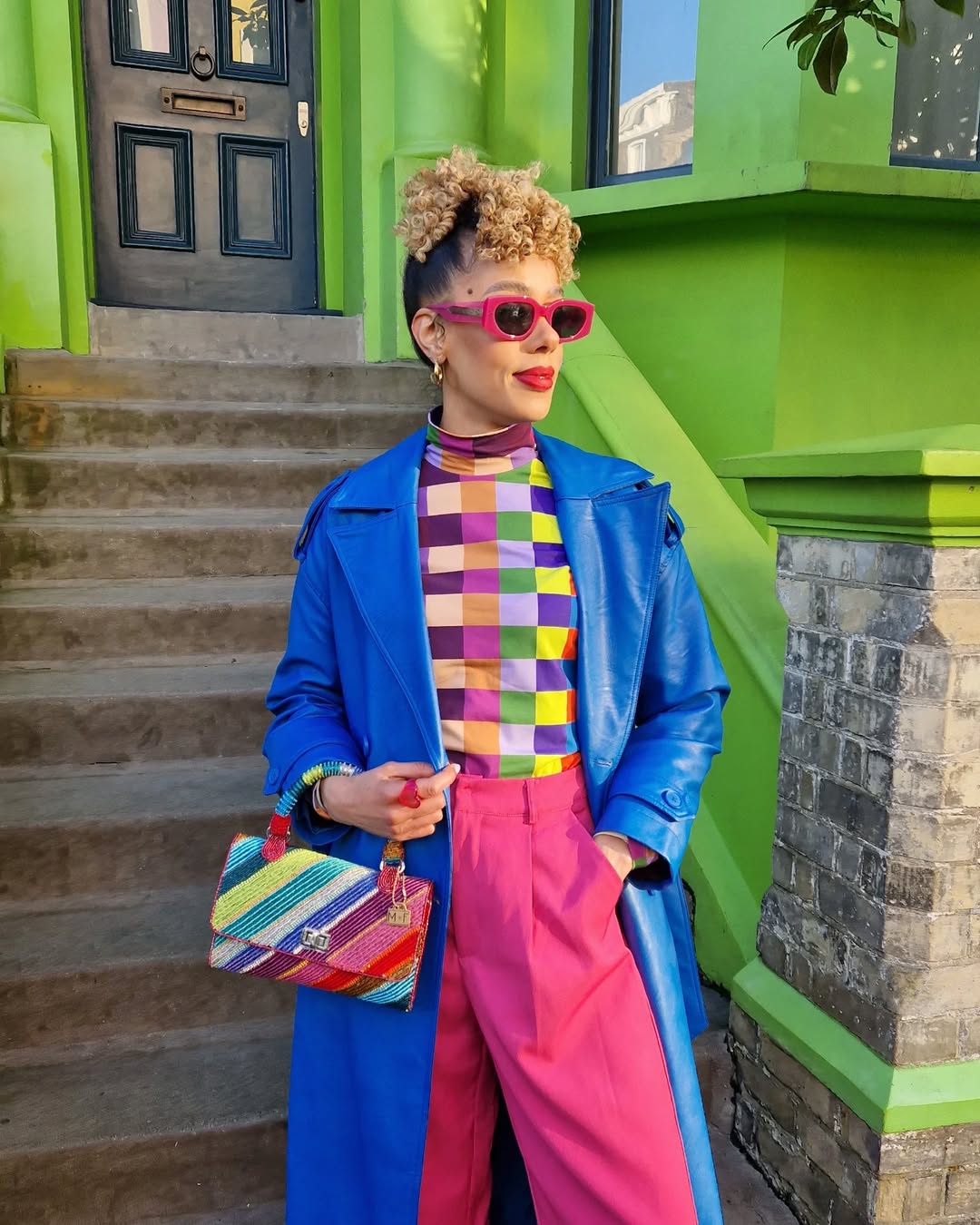
For those who prefer a cooler, more structured alternative to red, cobalt blue is stepping in. It’s bold without being overpowering, making it one of the most versatile colors of the season.
This is a shade that looks high-end, even in simple silhouettes. A cobalt blue suit feels just as powerful as a classic black one, but with a more fashion-forward energy. A structured cobalt handbag is an instant outfit elevator, whether paired with neutrals or other strong colors.
When styled with white or gray, cobalt feels crisp and modern. But paired with buttery yellow or warm coral, it takes on a softer, more wearable quality. The key to making it work is letting it be the focal point—everything else should complement rather than compete.
Sunwashed Yellows
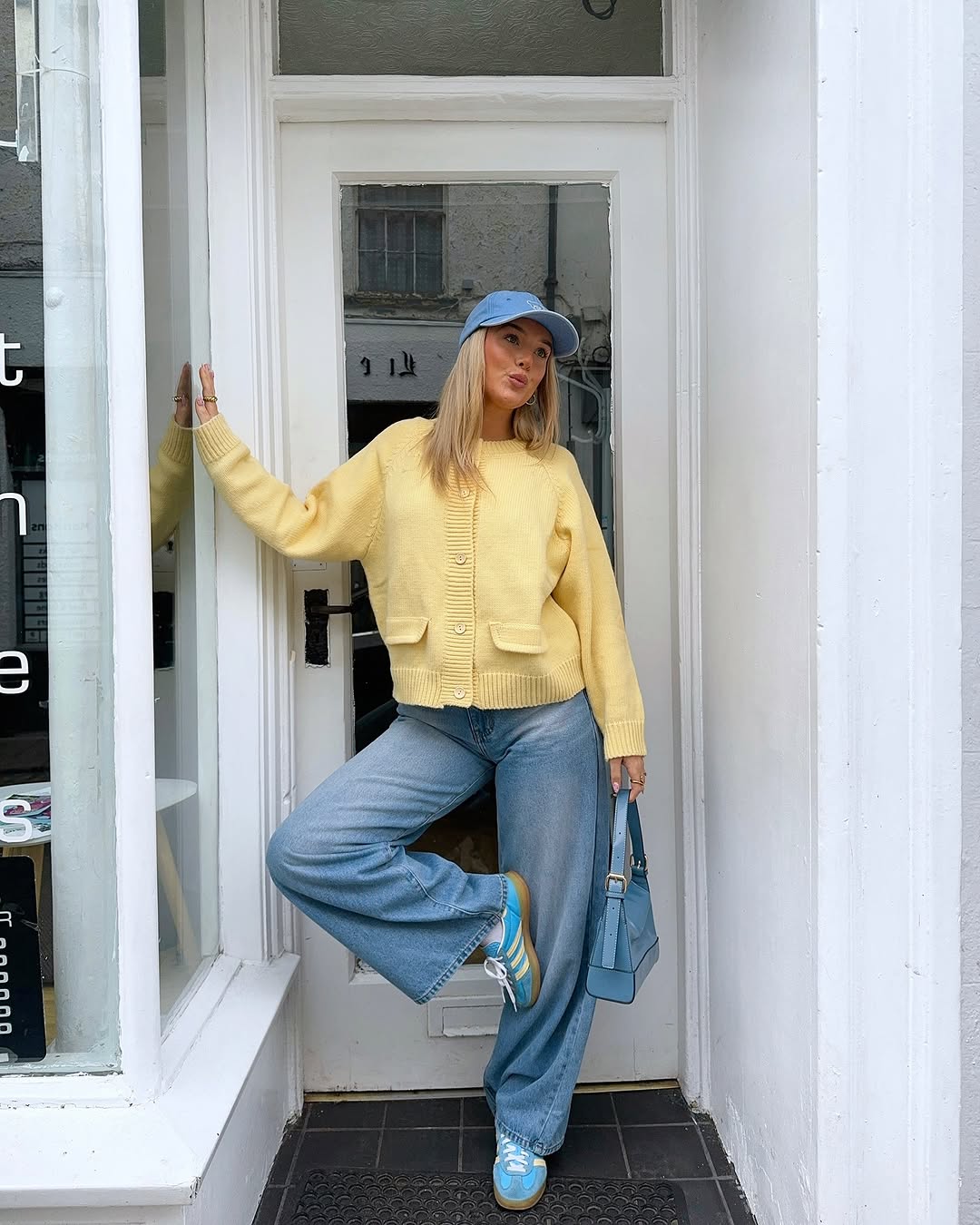
Yellow has always been one of the more polarizing colors in fashion, but Spring/Summer 2025 is giving it a softer, more nostalgic feel.
This season’s yellow isn’t neon or hyper-bright—it’s buttery, golden, and slightly faded, almost like it’s been sitting in the sun for just the right amount of time. It works well with earthy tones, but it also pairs beautifully with powder blue, soft lavender, and warm taupe.
Accessories in sunwashed yellow are becoming a go-to. A soft yellow crossbody purse instantly makes a neutral outfit look more modern. Strappy sandals in a muted golden tone feel like an effortless update to classic nude styles. It’s a way to incorporate color without fully committing to it, which is exactly why this trend is taking off.
Turquoise and Aquatic Blues
Fashion has a way of mirroring cultural moods, and the turquoise and seafoam blues appearing in collections feel like a reaction to the collective craving for escapism. These colors have an easygoing, sun-drenched energy that makes them perfect for vacation dressing but surprisingly wearable for everyday outfits, too.
Designers are playing with shades that mimic natural elements—deep ocean blue, misty teal, and soft seafoam. Worn alone, they feel serene and calming. Paired with warm neutrals or golden tones, they become unexpectedly chic.
Even if head-to-toe turquoise feels like too much, accessories in this shade instantly brighten an outfit. A woven beach bag in a muted teal or a pair of strappy heels in a rich blue-green can do more for an outfit than an all-neutral palette ever could.